Real World Development
ENGR 485: Selected Topics brought together engineers, coders, and designers to collaborate on real-world projects. Our team met with our clients Laura Sharp and Bria Wolter, both new mothers. Their vision is to create a spiritual app for busy mothers, providing short, digestible prayers, liturgies, and devotional reflections to help them find peace and connect with God. Through this process, our team learned how to work with a client to meet their clients and how to create both the front and back end of the app as a team.
We hope to continue this project during the 2024-2025 academic year and have a completed app on the iOS app store by April 2025.
Meet the Team
Morgan Maxfield: Computer Science major, Marketing Minor.
Leah Feller: Graphic Design major.
Alexander Rohwedder: Computer Science major, Marketing Minor.
Nicholas Alyateem: Computer Science major.
“Becoming a mom is marked by all kinds of moments…The overwhelming, the aching, the joyful. Through prayer, poetry, encouragement, and more - we want to turn our attention to His reality no matter where we find ourselves. May each moment be open to God’s love”
- Bria Wolter & Laura Sharp (Co-Authors of App Content)
UX/UI Specialist
My role in the group was working as the User Experience and User Interface specialist. Utilizing my skills in design and coding I was able to assist the team in creating a cohesive look and feel for the app to achieve our goals. Our team all met and communicated with our client multiple times throughout the process of this project and that helped us meet their needs effectively. Overview of the tasks I’ve completed so far on this project have included setting up doing background research into the preexisting market, and nailing down the app feature requirements to start developing our user flow. Synthesizing our user flows and creating UX wireframes. Turning those wireframes into lofidelity prototypes for testing. Then studying the accessibility of the design and formulating final prototypes with development that met design requirements based on the style guidelines I outlined.
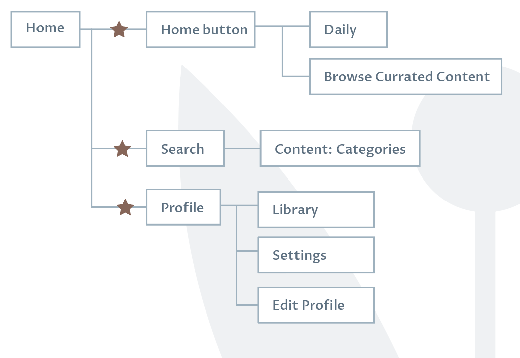
Studying User Flows
We conducted user testing on our two User Flows titled Balsamiq #1 and Balsamiq #2. Using Adobe XD we were able to ask our clients and friends for their thoughts.
Balsamiq is a low-fidelity wireframing tool that we use to capture and communicate our design ideas. We mapped out single static pages of app screens and linked interactive elements together. Next, we used Adobe XD to finalize our flow and conduct user testing. Similarly, we used Adobe XD to wireframe out ideas and link interactive elements together.
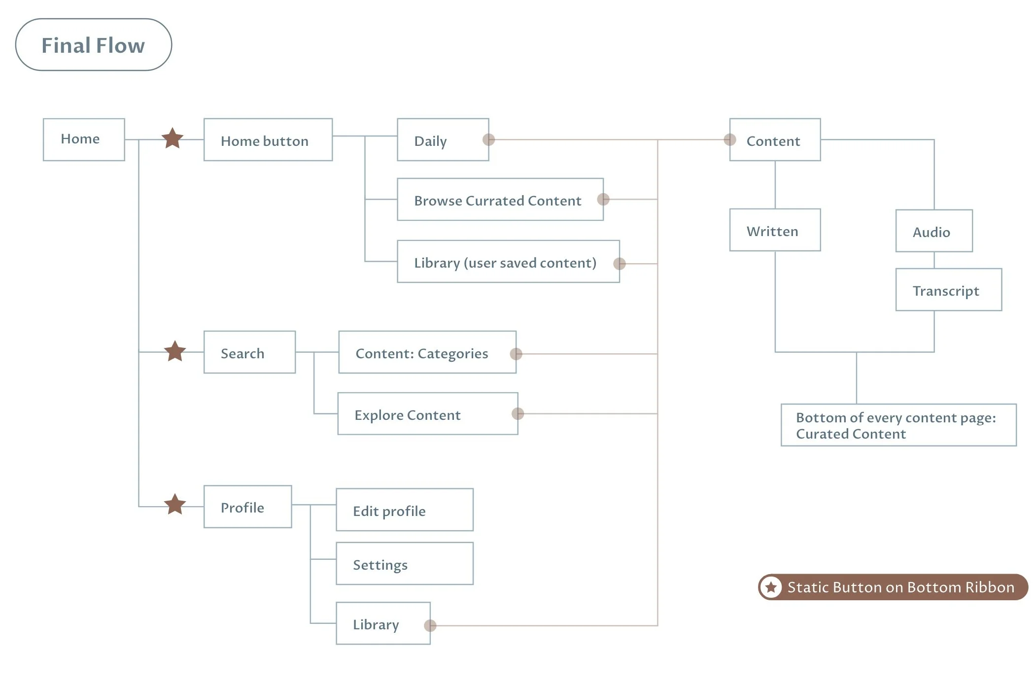
Shown is the Lofidelity clickable prototype of our initial draft Balsamiq #2 along with an image outlining the webflow path structure. From there we could compare the two flows, and our feedback to create a final user flow.
Design Work
To create the overall look and feel for the app I wanted to present the client with multiple concepts. My approach was formulating multiple mood boards and creating mockup examples of how the app could function with the design. The goal was to create a style to show a place of peace, encouragement, and spiritual connection.
After meeting with the clients, they both concluded that they liked the function of design B but liked the style of the last design D. So I worked on bridging the style gap between the two designs.
Where we left off
Our team is picking up where we left off in August but until then check out the booklet to see my part of the progress.


